Tag: botanical illustration in watercolor

Pink Lilies in Watercolor

Pink Lilies in Watercolor

Pink Lilies in Watercolor

The gorgeous gold tone on the flower buds and stems is green gold by Winsor Newton–one of my favorite colors. It looks fabulous paired with the pink and coral tones in the flowers. I painted the veins on the leaves with white acrylic ink and a Number 1 round paint brush. This painting is based on a tutorial in Fiona Peart’s book, “Vibrant Flowers in Watercolor.” It’s a great book for beginning–or seasoned–watercolorists. Watercolors and acrylic ink on cold pressed Acquarello Artistico paper by Fabriano.

Here are some close-up views:

Pink lilies in watercolor - closeup view

Pink lilies in watercolor--close up view

Columbus Day Paint Fest: Stargazer Lilies

During our Columbus Day family paint fest my daughter painted these gorgeous stargazer lilies. I love the combination of yellow, pink, purple, and touches of blue she used on the petals and the fine details she added with acrylic ink. This painting was based on a tutorial by Wendy Jelbert in the book, “Flowers,” by Wendy Jelbert, Michael Lakin, Fiona Peart, and Wendy Tait.

Here’s a close-up view of her painting:

Watercolor Sunflowers

I painted these sunflowers a few months ago but wasn’t happy with the results, so I thought I’d paint them again using a slightly different color scheme and a highly saturated background. This painting is a based on a tutorial in Fiona Peart’s book, “Vibrant Flowers in Watercolor.” The background technique is based on a tutorial in Janet Whittle’s book, “Watercolor Roses.”

Maigold Roses Complete

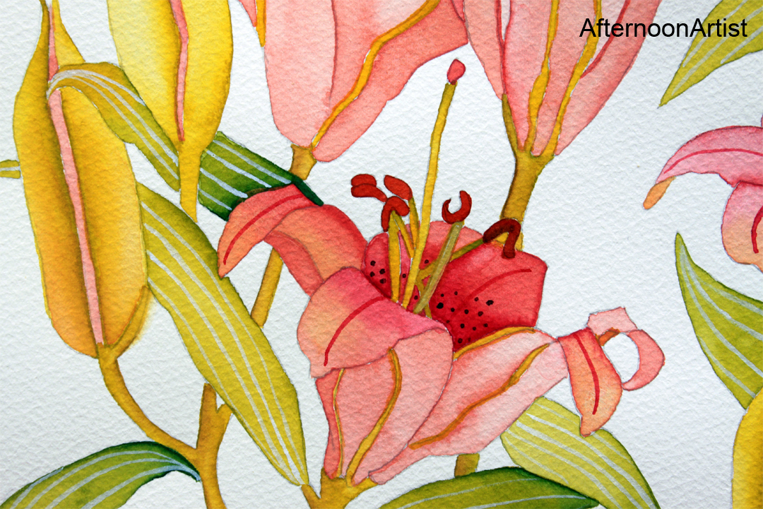
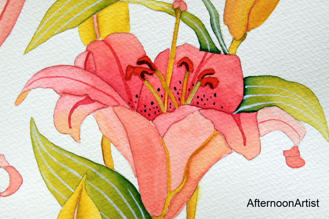
I just completed this painting a few minutes ago and was so pleased with the results that I had to post it right away. I darkened the background a bit behind the leaves on the right-hand side to increase the contrast, I added veins to the leaves using a negative painting technique, and added veining to the rose petals using a very diluted brilliant red violet, though next time I would dilute it even further because I think the lines should be even paler than what’s shown here.

As I mentioned previously, this painting was based on a tutorial from Janet Whittle’s book, “Roses in Watercolour.” Since Ms. Whittle stressed that using the right type of paper was very important to achieving this type of background wash and I didn’t have the paper she recommended on hand (Arches 140 lb. Not paper), I practiced her wash technique on the four types of paper I had on hand–Fabriano Artistico Hot Pressed, Fabriano Artistico Cold Pressed, Canson Aquarelle/Acuarela Cold Pressed, and Aquarelle Arches Cold Pressed. It was a worthwhile experiment because the results varied widely with each type of paper, and the Aquarelle Arches Cold Pressed 140-lb. paper was the hands-down winner.

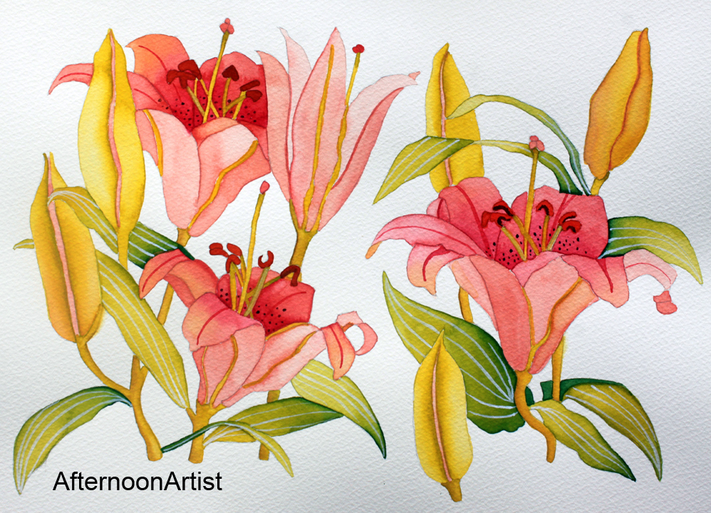
My palette consisted of Winsor Newton opera rose, aureolin, quinacridone gold, Winsor red, indanthrene blue, Winsor violet, and perylene maroon as well as Schmincke brilliant blue violet, May green, helio green, and brilliant red violet.

I will definitely be using this wash technique in the future as well as some of the other techniques I learned from this book. I highly recommend it.

%d bloggers like this: