Posts Tagged ‘botanical art’

This tulip painting looks deceptively simple but it was time consuming and challenging to paint. I found the giant tulip on the left to be particularly challenging since I had such a large area to cover. The orange areas on the tulips required several washes to create an intense color. I painted the yellow areas first and then washed the orange on top; however, the next time I will reverse the process and paint the dark orange first and then apply a yellow wash on top. Each painting is a learning process.
This painting is for my sister with much love.
Like this:
Like Loading...

My goal for this painting was to keep the subject simple so I could complete it quickly. But looks can be deceiving, and these water lilies proved to be quite time consuming and challenging. It took me several attempts to render realistic dew drops but I finally began to nail them on the leaf on the bottom right-hand corner. Once I figured out the technique, painting dew drops was surprisingly quick and easy.
The swampy water, on the other hand, was even more challenging. It’s definitely not what I envisioned; and I obviously need more practice painting water. If anyone has any tips or tricks for painting water that they’d like to share, I’m all ears!
This painting was based on a tutorial in Linda Ravenscroft’s book, “How to Draw and Paint Fairyland: A Step-by-Step Guide to Creating the World of Fairies.”
Like this:
Like Loading...

My niece, Karen, also painted rainbow tulips then tried her hand at stippling with a micron pen, choosing colors to match each flower. She painted the cloudy background without the use of masking fluid, which can be tricky, but she did a fabulous job.
I’m still completing my painting since I spent more time as a host, helper, photographer, and instructor during our family paint-a-thon than I actually did painting. I’ll be posting my painting next.
Like this:
Like Loading...

I’m so excited to show you my sister’s finished watercolor painting. The addition of the swirly texture–inspired by artist Cindy Dauer at TheSlumberingHerd.com–really made this painting come alive. My sister wasn’t thrilled with the dark green background–she felt it obscured the ink details–so I lightened it in Photoshop so she’d be more satisfied with the end result.
After I lightened the background I played with Photoshop’s Hue setting (Image>Adjust>Hue/Saturation) and came up with several variations of her painting in different colors. It looks amazing in the different color combinations and would make a great art grouping in her new house. Are you ready to see this? I’m so excited to share!

In orange and teal. Fabulous!

In hot pink and lime. Be still my heart!

In purple and green. Delightful!

In yellow and aqua. What’s not to love? How do you like your painting now, sissy? It’s perfection.
Like this:
Like Loading...

This past weekend I hosted a family summer watercolor fest. My sister, niece, daughter, and I had a great time painting, chatting, singing Taylor Swift’s annoying song, “we are never-ever-ever getting back together” over and over again, and snacking on caramel macchiatos and homemade brownie cupcakes. The cupcakes were amazing; I’ll be posting the recipe next.

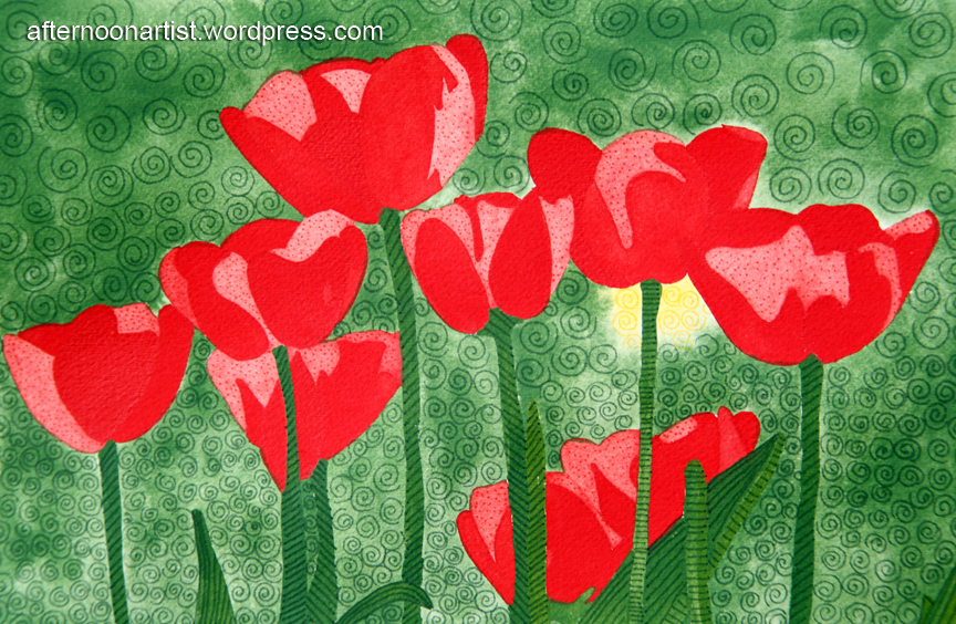
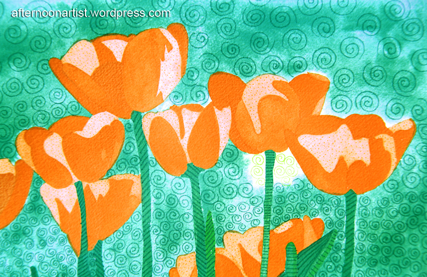
For this painting session we thought it would be fun to paint the same painting and compare our individual results. We took this challenge a step further and decided to add texture with pen and ink on top of the completed paintings. We were inspired by the work of artist Cindy Dauer and her Slumbering Herd. If you’re not familiar with Cindy’s work, check out her blog, The Slumbering Herd, and prepare to be delighted.

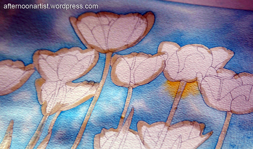
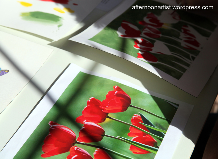
Here, I applied liquid frisket to mask out the tulips, leaves, and stems while I painted the cloudy background.

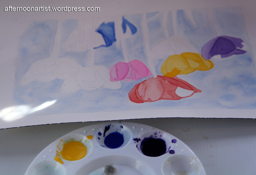
This is my niece, Karen’s painting in progress. It’s upside down in this view because I was sitting across from her when I snapped the photo.

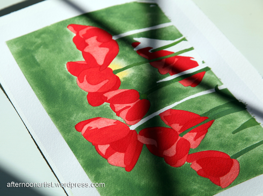
This is my sister’s work in progress. She chose colors that closely resembled those in the reference photo, but then went crazy with ink and texture. You won’t believe how many looks she was able to achieve with this painting. I’ll be showing photos of the completed paintings next.

This Winsor Newton watercolor chart came in handy when we were choosing the color schemes for our paintings or trying to match a color in a reference photo. If you ever have an opportunity to host or join a painting party, I highly recommend them. They’re lots of fun and a great learning experience.
Like this:
Like Loading...


It was a dreary day today–cloudy, cool, and drizzly–not the best day to be outside but a perfect day to stay inside and paint. The soft lighting allowed me to sit by the kitchen windows and paint for hours without interruption from the late afternoon sun. These pink miltonia orchids were a pleasure to paint. The variegated leaves were easy to paint and the brightly colored petals really pop against the dark green background.
This painting was based on a tutorial in the book, “Orchids in Watercolor” by Ann Mortimer.
Like this:
Like Loading...

Here’s a peek at my latest painting. I hope to finish it this evening. I’ve been so busy with spring cleaning and home improvement projects that I’ve had little time to paint. I have several interior decorating projects underway, porch and deck makeovers in progress, a massive yard cleanup, custom curtains to sew, and a few painting tasks to complete–some involving plenty of spray paint (you know how much I love spray paint). Oh, and lots of fun shopping with my mom. I can’t wait to finish all these projects and share the results with you.
I hope you’re enjoying the warm spring weather as much as I am.
Like this:
Like Loading...


My daughter painted these gorgeous miltonia orchids during a recent late night mother-daughter painting session. I love the bits of white she left on the edges of the petals and the one bright white flower to the left of the center of the painting she chose as her focal point. And of course I love the bright, highly saturated colors.
This painting was based on a tutorial in Ann Mortimer’s newly released book, “Orchids in Watercolor.”
Like this:
Like Loading...

I thought it was time to switch gears from painting fairies and focus on botanical painting this weekend. Variety is the spice of life, right? I’ve never painted orchids before but I was drawn to the soft pinks and purples in this variety. I think the natural touches of red in the center of these orchids add interest to the painting and keep it from looking too monotone.
I’m particularly pleased with this color scheme. The colors are bright and soft at the same time. For the background I dropped in cobalt blue, cerulean blue, aureolin, and permanent rose. For the flowers I used permanent rose, cerulean blue, aureolin, and Winsor violet. For the leaves and stems I used green gold, cerulean blue, and raw sienna. This painting is based on a tutorial in Ann Mortimer’s new book, “Orchids in Watercolor.” Here’s a close up view:

Like this:
Like Loading...

My niece Karen chose to paint these yellow trumpet flowers. This is her second watercolor painting and her painting skills have improved a great deal already. I love the shading in the center of the flowers–it gives them such depth–and the sunny color scheme she chose. This painting is based on a tutorial in Janet Whittle’s book, “How to Draw Exotic Flowers in Simple Steps.”
Here’s a close up of Karen’s painting, isn’t it pretty?

Like this:
Like Loading...